Tuesday 30 July 2013

What is a Poster?


A Poster is a method of distribution used by Film companies to deliver a quick message about the film and why the potential audiences/demographic should go and buy tickets to see their film over any others. The poster has to give the audience information such as the genre of the film, cast and crew, institution. Links to viral marketing such as website, Twitter and Facebook may be included on the poster.

Genre

The genre of the film can be conveyed through the imagery, iconography, font and colour schemes of the poster. Colours such as red and black can be used together to convey the horror genre. This would be confirmed in any font and imagery used. Red carries connotations of blood and sex, these are usually in abundance in the horror genre. Black symbolises death and night, much of the genre takes place at night- when people are most vulnerable.


Imagery can used to show genre but it can also be used to show that the film is based on a book/comic-book or is a sequel/remake of existing films. The imagery can be even more effective than the title of the film, especially for a teaser poster.


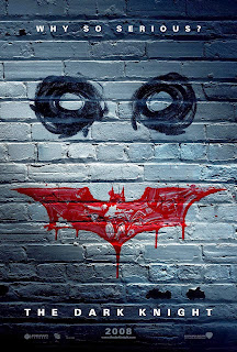
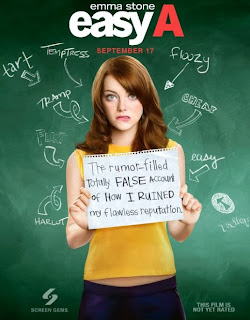
The font used on posters will also help to sell the genre to the audience, if the font is more scrawled or savage looking the audience will know it is more likely to be a horror film. If the font is colourful and basic it could be a romantic comedy or a teen/coming of age film.


Other Information included in Posters:

Release date
The release date of the film is usually included although the poster may just say "coming soon" this is to make the audience anxious for the films release. But, the release date could be referred to as "Summer 2014" or "Thanksgiving". But this is to get the audience thinking about going to see it and arrange with friends to go and see the film. 

Institution
The institution logos and names are also included, this is so the audience can research the film if they are interested and also if they have liked 

References
This is when a film is marketed using the success of the previous films made by the producers or directors. For example "from the Director of Inception"


Cast/Crew
Images of the cast may be on the poster. But if there are big names involved in the film they are also likely to appear on the poster, so fans of the actors may also want to see the film. The poster may also state if the actors have won an award "Academy Award Winning..."

Reviews
The poster may include quotes from good reviews or a star rating from various magazines. This is so the audience thinks the film is good and are more likely to spend money on something they know is good. 


I think this poster overuses the reviews, but in this case it is effective at selling the film, as it shows how hugely successful it is. But aesthetically it is not very pleasing, it seems too cluttered. 

Age Rating
These are not often included on posters. This is due to the genre that is shown through the poster. It is obvious what demographic it is aimed at.

Tag Line


Taglines are used to give a snippet of the plot to the potential audiences of the film and is also a memorable line that makes people remember the film and therefore they will be more likely to see the film if they can remember it. The majority of films have just one tagline but some films have a number of taglines which they use in teaser posters and character posters (like the above posters).


Teaser Poster
Teaser posters are made for films to help assemble a following for the film and also to build hype for the film. The Teaser poster will give key information such as the title, institution and a release date. They may also include more such as the genre (using imagery and iconography). The teaser poster for Frozen (dir. Jennifer Lee & Chris Buck 2013) shows the five main characters, they are partially covered so it keeps some mystery as where all the characters fit into the plot. The institution logo for Disney rests on top of the title which tells us this film is for children, families and fans of Disney. This is reinforced by the text at the top, informing the audience this film was created by the same people responsible for Tangled (dir. Nathan Greno & Byron Howard 2010) and Wreck-It Ralph (dir. Rich Moore 2012). The poster also states the film will be released around Thanksgiving but it does not give an exact date. This is so that they can postpone the date slightly if a film with the same demographic will be released then, it also keeps the audience interested and looking for more information on the film.


Main Theatrical Poster

The Main Theatrical Poster emphasises on the existing information known about the film and also gives more to the audience. The Main Theatrical poster for Frozen again relays the information about the creators and the institution but now gives the audience a full look at the main characters of the film. By the way the characters are dressed you can see the two on the right (Anna and Hans) are dressed well which tells the audience that it being a Disney film they are a Prince and Princess whereas the man on the right (Kristoff) is wearing working clothes- this shows that he is possibly the unlikely hero. The woman on the far left (Elsa) is wearing all ice related colours which suggests that the film is about her. Also, Elsa has a snowflake floating above her hand and this also shows that she has magic (usually a main element of Disney films). The exact release date of the film is also given so audiences know when to book tickets and go and see it. A Facebook link is at the bottom of the poster so the potential audiences can go on to gain more information about the film by being linked to the viral marketing.


Thursday 25 July 2013

Trailer Analysis and Influences

To create a film trailer, we need to analyse existing trailers of a similar genre. After analysing the trailers we will use them as influences and inspirations for the creation of our own trailer. Following or going against the conventions of the trailers we have analysed.

The Hunger Games (dir. Gary Ross 2012):

As the film is about the adolescent struggle survival in a harsh reality we decided to examine the trailer so we could create a similar feel to it and use it to attract our demographic.

The Production Company's logo is after the beginning sequence of the trailer, this is so the audience gets a little bit of a taste for the trailer before knowing what company has produced it. The shots involve a lot of movement on steady cameras. These are cameras not on tripods they add more of an immersive feel to the trailer.


The relationships between the characters is made explicit with the use of close-ups and reaction shots of the main characters.  This builds an attachment to the audience as they begin to sympathise and empathise with the characters. We would follow this convention of the genre, we need the audience to feel for the characters even though they are not watching an entire film about them. The shots in the trailer are very tightly framed this adds an intimate feel and also adds a sense of entrapment and claustrophobia and  It becomes obvious due to reaction shots and Katniss' desire to not have her sister be a "tribute" that this is a bad thing. The scenes between Katniss and Prim show Prim's fear of being chosen and the bravery of Katniss for taking her place.

There is some copy that tells the audience the film is based on a best-selling book. This means that fans or readers of the book will want to go and see the film, also the people who were interested in the book but haven't read it will also want to go and see it. This is the USP of the film and by including it in the trailer it attracts the same demographic as the book.

 Non-diagetic is heard throughout, during the selection process, it is a drumming sound- to build suspense and tension in the trailer, so the audience already feels as if they are watching the film in the trailer. The music builds up towards the end of the trailer again to build suspense as the Hunger Games begin, with the contestants arrival. The trailer goes against Prop's theory in the trailer, even though she is not allowed outside the fence it shows that Katniss' life is at equilibrium, then it is soon disturbed by the reminder of the authority she lives under and the selection process follows. This disturbs the equilibrium but at the end it is not shown to be solved. This means the audience will want to see the film to find out who wins and who dies. I would like to incorporate the use of tension and curiosity for the audience to want to see our film, they will want to know who wins the struggle for survival.

 There is use of dialogue as narration in the trailer as well, the man talks about the way the Hunger Games work- this is used as narration to explain to the audience what the main character faces. By showing violent and aggressive shots of Katniss' opponents the audience begins to sympathise increasingly for her- this is due to the fact that she faces strong opponents. But the audience is also shown that the main character is not weak- she has talents too and this makes her an admirable character for the audiences to root for. A two-shot of the main characters is used to show their relationship, this shot is tightly framed which again shows how they are trapped and have to enter the games to survive. There is shot reverse shot which shows Katniss turning her attention to Peeta, this shows the audience that their relationship has changed due to the games. Copy is used in-between shot of Katniss preparing for the games and this increases the pace of the trailer as the non-diagetic music builds up.

There is a close-up of Katniss receiving the mocking-jay badge which is the logo for the films and book series. This is another hint back to the book for the people who are fans of it. There is a countdown used to increase excitement and suspense. There are shots shown in sync with the countdown showing the people in Katniss' district, her sister, her friend Gale (who is also a romantic interest). There is a mid shot of Katniss in a glass container which also shows how she cannot escape- trapped. There is a loud  non-diagetic banging noise and then everyone starts running off which then cuts to a point of view shot. Then the Logo appears, this makes it more memorable to people who have not read the book. The tag line appears 'May the odds be ever in your Favour' this is accompanied a Twitter hashtag '  #HEADFORTHESQUARE' and the next bit of copy afterwards is a Facebook link. This shows how viral marketing is integrated into other areas of distribution such as Trailers and posters.

From this trailer we would like to use influences such as the sibling bond and the protection the elder sibling has to provide. This will involve a number of two-shots to construct an endearing, close and protective relationship.We would also like to use a lot of camera movement so as to keep the frame always seeming to be on the move. This fits the genre as it is suggesting that in order to survive you have to stay on the move. By not using a tripod for many shots we should achieve this. We also liked the idea of a countdown towards the end and an open ended-trailer so it leaves the audience with a lot of questions. We would also create a Twitter and Facebook account to use as links in our trailer, so we are exploring viral marketing and linking it to our other forms of distribution.

The Road (dir. John Hillcoat 2009):

This Film is about a father-son relationship in a post-apocalyptic world filled with many dangers such as starvation and gangs of cannibals. We wanted to look at this trailer because it has similar themes of social-criticism.

The trailer goes against Prop's theory, the trailer begins with the problem. We would like to also use this in our own. Copy is then used to explain that the world has changer. This informs the audience that this film is about the end of the world. We are then shown desolate shots of the world that would usually be populated. A non-diagetic sound of a bass is heard accompanying each shot of an empty area.

 Copy is also used to show signs of life such as 'Wake' and 'Breathe' this makes the audience think about survival and the struggles in a harsh world that is in the film. This also relates to a primitive style of life, so people have a more basic array of tools and have to become more independent and rely on instinct. The trailer also shows the interactions of the family, the bond between father and son, but also the arguing with the father and mother. We would also like to include the relationships of family within the trailer. There is shot-reverse shot and two shot to show the connections between the characters.

minute into the trailer another problem is presented, the violence and cannibals come into the trailer, this presents the audience with a sense of urgency and panic. A mid shot of heads on stakes appears quickly before becoming a negative and cutting away- this shows an increase in the dangers, for the father and son, in the post apocalyptic world.  There is a non-diagetic sound of unsettling music when the cannibals are searching for them using flaming torches. A wide shot/pan is used to show the large numbers of cannibals before the camera lowers into a two-shot of the father keeping the boy quiet while they attempt to hide on the cannibals closing in.  This engages the audience to sympathise and empathise by using a young vulnerable child and a concerned parent.

   The camera becomes more shaky when there is a tense conversation between one of the men with the father and son this shows the increase of adrenaline and reminds the audience of the constant threat of danger.   The non-diagetic music quickly builds up until the diagetic gunshot. There is a strobe edit then followed by some copy explaining what else the author has written. This also means that fans of the author will be encouraged to go and see it. The cannibal is not seen being shot but this adds to the demographics curiosity and also means the trailer can be shown to younger audiences.

There is a quick montage using fast fades accompanied with non-diagetic music that goes in time. The shots include the cannibal group accompanied with the voice over/dialogue of the mother saying "they're gonna catch up with us" this again brings in a sense of urgency and also the copy appears saying "at the end of civilisation" this reaffirms the fact the world has been dead for some time and people have become more primal. There is a reprisal of the montage and music, this shows the man's weapons and violence such as knives and close-ups of the man with a gun.

By using non-diagetic music to quicken the pace, many tightly framed action shots are used in combination with wide shots. The copy becomes more frequent and the font looks more aggressive than earlier in the trailer. The copy begins saying commands to do with survival, but these are more urgent like "sacrifice" and "protect". This further leads the audience to empathise with the father due to him protecting his son.

The cast and crew names along with the institution and production credits at the end of the trailer. They are accompanied by the title of the film and the website, this is so interested people in the audience can go away and research more about the film virally. The release date is shown along with "Everywhere" this links to the apocalyptic feel and large scale.

 From this trailer we would want to take influence of the non-diagetic sound and wide/location shots, to show how the world is desolate without adults. We also want to use copy towards the end that covers the themes of surviving in a harsh world. We again liked the family quality and to use it in a way to engage audiences. We liked the shots using low-lighting such as matches- this suggests how dark the world has become. We would also like to have web-links and the title at the end of the trailer so the audience will remember it.


Tomorrow when the War Began (dir. Stuart Beattie 2010):

This film focuses on a group of teenagers who have to try and survive in their country that has been invaded. Everyone they know and love disappears after they return from a camping trip. We wanted to look at the trailer for influences because it covers similar themes of survival.

The trailer begins with the first institution logo and then cuts to a long-shot of a motor bike going through the shot, there is no music and only the diagetic sound of the motorbike can be heard. This seems to add a sense of realism to the trailer. This is followed by a wide shot of a house, there is an overlap of audio. Starting as contrapuntal/non-diagetic sound and then becoming diagetic in the next shot due to a shot reverse shot with the two girls. Non-diagetic music begins to fade in and is then accompanied by the second institution logo as the music kicks in fully. This is followed by a number of wide low angle shots- a helicopter will have been used (aerial shots). This is to show the expanse of wilderness that the group of friends go camping in. 

The copy such as "a place to escape" and "a perfect time" suggests that something bad could happen, but it seems like a teen-movie at first due to the comedic shots of the boy- Homer being distracted by Fi changing into her bikini. There are a number of group shots of the friends laughing around the fire, but the music fades out as a point of view shot is used to show jets flying through the sky. The mise-en-scene changes after this, the clothing looks dull and the areas of land look like they have been through a draught. The camera work becomes slightly more shaky, this could reflect the loss of control.


There are a few shots showing that the families have disappeared along with the fact "there's no dial tone." Copy informs the audience that the film is based on "the best-selling novel by John Marsden". This will make fans of the book interested in going to see the film, and other people who may not have gotten round to reading may think about seeing the film more. After this the pace accelerates very fast, this shows how much action there is in the film by the number of explosions, smashing windows. But, we see a glimpse of the teen movie mood again through a suggested romance: A shot reverse shot of Homer winking at Fi.

The music comes to a sudden end as the title of the film appears. This is then followed by a shot of the friends riding away on motorbikes, it is noticeably darker which shows how the mood of the film changes. This is with a narration taken from dialogue "what do your instincts tell you" there is a close up of the main character saying "that it's time to go to war". After this we are told the film is "coming soon" and there are institution logos at the bottom along with a website to link to the viral marketing.


We wanted to take influence from the simplistic font style of the copy along with having the institution logo a little bit later. We also liked the idea of using a campfire in our film to make the group of friends seem closer. We also liked the idea of overlapping dialogue. I did not like the pacing of the trailer it is very slow and then suddenly speeds up towards the end. I would prefer a variation of paces to be used. We thought we should also include the film was based on a bestselling book (we would base it on a book if we could) so we could use it as a USP to attract audiences. We liked the use of clothing to show the changes that have happened, we also liked the snippets of scenes shown where the group figures out that the adults have been taken.


The Hunger Games: Catching Fire (Dir. Francis Lawrence 2013)

We also decided to look at the sequel of The Hunger Games. As it includes the similar themes and ideas of the first film.


We again liked the open-ending to the trailer, we also wanted to use the over-lapping sound/dialogue to make the trailer flow better. The Trailer also has the institution logo after 30 seconds in, so people can remember it. This is something we would want to use in our trailer. Also we liked the use of the younger sibling to engage the audience. 

Monday 22 July 2013

Producing the new Logo


Last year we had designed and created our own logo and animation for our production Parallel, the link below will take you to a blogpost outlining the process of producing our first logo for Eden Pictures.


In the fashion of many Hollywood studios (e.g Paramount Pictures and Universal) who had recently updated their logos after their 100th anniversary we decided to celebrate our first anniversary in a similar way. This contributed to the idea that we are a Hollywood-style studio and also meant we could make our logo to match the aesthetics of the trailer but also make the logo a higher quality design and finish. After improving our use of the programme Serif Draw Plus. We made the decision to have no animation as it would appear in the trailer for a few seconds.  Many Hollywood institutions had a fast-forwarded version of their animation or just the logo appear at the beginning of the trailer. Due to this we also would not include the music that had accompanied the previous year's animation and logo.


We changed the style of font to a much more robust shape and style, last year's logo was more fragile looking, we wanted our logo to reflect that we had strengthened as a group. The silver also looks more professional and has a better finish than the stony gold. We exchanged the apple blossom for a red rose, this was because we felt the apple blossom was badly designed and we could do a much more ambitious design, we opted for the classically dangerous red rose, by adding the lighting in the right areas on the petals it appeared much more sleeker and more realistic. We made the vines a darker shade to match the darker tones of the genre we were planning on making our film. We kept the apple from last year because we wanted the audiences to see something familiar in the logo.

 
We used a similar technique to creating our first logo, we sketched out the logo with the font, vines, and rose. This gave us the freedom to make our logo's font completely unique and original, we were not restricted to the fonts available on Serif Draw Plus. Although, this time instead of going over the drawing of the flower (rose), we used a photo and created individual overlays as petals and then deleted the photo behind it, after the shading was complete the result looks realistic and professional.


In order to make the logo dynamic and interesting in the trailer we added a flash effect (fast fade to white) to give the company's logo an entrance, this was accompanied by a recording of thunder that I had filmed earlier, it was Lizzie's idea to include the sound effect. This was to foreshadow the idea of the oncoming storm and the conflict that is palpable in the trailer. Although, we also had other ideas about using the thunder sound recording, such as having it at the end of the trailer.

Friday 19 July 2013

Choosing a Genre

Before we could analyse and take influence from any particular trailers we had to make a decision as to what the genre of our film will be. We narrowed it down to two genres that we all agreed on: Coming of Age/Teen Movie and Teen Apocalypse. We chose them because we believed we had the resources to create these films (being teenagers) and it was also different to the other genres we had previously produced: Comedy and Thriller.

Coming of Age/Teen Movie

Having seen films such as The Perks of Being a Wallflower (dir. Stephen Chbosky 2012) and Mean Girls (dir. Mark Waters 2004) we thought about perhaps going down a Teen Drama or Teen Comedy route. Looking at storylines of books and films of the genre to base our narrative ideas on such as: The Summer I Turned Pretty (by Jenny Han). We then came up with a basic storyline involving a love triangle, thus covering issues such as relationships and sexuality. Watching trailers for the appropriate genre we have since found that it would be very difficult to find a Unique Selling Point (USP) for our film's plot, many Teen Movie trailers are very generic and a bit cheesy. We then went on to make rough sketches and designs for posters and magazine covers for both genres, however we began leaning further towards Teen Apocalypse as we felt it would be more unique and also more of a challenge.

Teen Apocalypse

We have often seen trailers for films about the apocalypse such as 2012 (dir. Roland Emmerich 2009) and The Day After Tomorrow (Roland Emmerich 2004). Even trailers for films set after the apocalypse in their own genre of post-apocalypse such as I am Legend and The Road (John Hillcoat 2009). We used a literary reference to help form ideas for our narrative. In the book The Lord of the Flies (by William Golding) a group of school boys are marooned on a paradise island- they soon split into two factions as Jack and Ralph battle to become "Chief". This is a socially critical novel demonstrating in a microcosm that without rules and authority we would descend into chaos. We decided that we too would like to demonstrate a more contemporary example of this social criticism, using the idea of adults disappearing rather than have them on an island instead have them on the outskirts of a small town.
 
We chose Teen Apocalypse we wanted it to be ambitious and also as a Hollywood-style institute it has not been explored in the ways we want to explore it. It is a different type of action and narrative compared with a film like The Hunger Games because that is very controlled and is focussed on the ending of the Character's lives rather than the world. We wanted to show total anarchy could follow the sudden disappearance of adults and authority. Although being a Hollywood company we wanted to make our film and it's trailer have a meaning and social criticism.


We made brief sketches of potential designs for posters and magazine covers for each of our favoured genres. This was so we could decide which genre we had more ideas for, we thought that the teen apocalypse had more room for creativity and so we decided to peruse this genre.


Saturday 13 July 2013

What is a Trailer?

Codes and Conventions of Film trailers


-The music and soundtrack of the film- this will help to show the genre of the film and may serve as a Unique Selling Point (USP), if a song by a contemporary artist or band is used. 
-A montage of key scenes to give some idea of plot, showing a range of camera shots and camera movement to make the film look dynamic and appealing to the audience.
-Even if scenes are shown in the wrong order the match-on-action and pace is kept to make sure the audience stays interested and does not get time to think too much about each scene. As time to think may give the audience time to think that they do not wish to see the film.
-The release date of the film, this is so audiences can think about arranging to go see the film, when I'm at the cinemas with a group of friends and see a good trailer we arrange to go see it when it is released.
-The USP of the film needs to be included, particularly if it is a sequel- this is so the audience know that the film will not be "more of the same"
-Voice Over/Narration/Copy is used to connect sequences and give ideas again to the narrative and genre of the film.
-The genre will be portrayed through a variety of means: narration, copy, voice over, imagery, key scenes used.
-The production credits are usually shown at the beginning of the trailer, so the audience can see whether the film is independent, hollywood, or independent funded by a hollywood company.
-The cast or crew can be included and may serve as a USP- if members of the demographic like a particular Director or Actor.
-If the genre of the film is fantasy, special effects are very important when marketing, they must be shown to be realistic and exciting; nobody would want to see a film that does not look realistic, it takes away from the quality and believability of the film.
-In trailers released closer towards the planned release of the film, age-ratings will be included- this can also help to show the genre of the film and if a horror film has a low age-rating the demographic may be more disinclined to go see it on the premise that it will be less scary. 
-In some trailers (horror in particular) include reaction shots of audiences, this is to showcase how scary the film is without showing too much of the film. An example of this would be one of the trailers for The Woman in Black:


-Reviews and awards may be also shown in trailers- this encourages other potential audiences to go and see it if it has already won awards. 
-The title of the film is usually shown at the end of the trailer so it stays in the audience's minds and the website is usually also shown at the end for the same reason
-A tagline for the film may me be shown at the end of the trailer with the title or somewhere else in the trailer like the beginning, the tagline is short and memorable and can also help audiences to remember the film and the trailer.


There are three main types of film trailer, they are designed to advertise and promote the film as well as build a following:


The Teaser Trailer 
  Usually released months or even up to a year in advance this is a short trailer designed to 'tease' the prospective audience and give them a taste as to the genre of the upcoming film. Whilst also giving them the basic information such as release dates, production company, director (other cast and crew) and may give a brief outline to the narrative of the film. By releasing the Teaser Trailer so early this gives chance for a following of the film to build up.


A Teaser Trailer contains basic information such as the time of release, this can be vague such as "Summer 2013" or a precise date. If the film is part of series or is a Comic book film, this can make it easier for a teaser trailer to be marketed using iconography- For the Dark Knight Rises (Dir. Christopher Nolan) there was a Teaser Trailer that lasted only a few seconds of the Batman symbol accompanied by the tagline of the film which was "A Fire will Rise".


The "Carrie" trailer features the institution logos of the company that produced the film, as well as the author Stephen King who wrote the original book. There is a continuous shot of the burnt and wrecked town that leads to a blood-soaked Carrie in her prom dress. This is accompanied by non-diagetic narration of different characters as well as an unnerving non-diagetic song. This is a remake so people will recognise the name Carrie and fans of Stephen King will be drawn to the trailer and thus- the film. The narration, music and imagery also leads the audience to know that the film is a horror genre and so the audience will be of an older demographic.


The film had another form of marketing, a coffee shop prank was made and filmed- then posted virally on YouTube. This was a teaser to audiences that a remake of Carrie would be coming soon. This links the trailer to the viral marketing. At the end of a trailer a strobe effect is used showing the character a blood-soaked Carrie. The film contains a hashtag link for Twitter and also the release date, again linking viral marketing and trailers.


Main Theatrical Trailer


Usually shown after the Teaser Trailer; the Main Theatrical Trailer builds on the narrative points, usually using a montage of around 7-9 key scenes- but not necessarily in the right order. The Main Theatrical also includes more information such as the cast and crew (and also awards they have won or previous films they have been involved in), reviews from magazines, age-rating, genre. A voice-over is commonly used so the audience know what to expect when seeing the film, a narration from one of the characters may be used. such as the Main Theatrical Trailer for Snow White and the Huntsman (2012 dir. Rupert Sanders) the Villain narrates the trailer but there is no such narration in the film itself. The Main Theatrical trailer may include more than one song or element of the soundtrack to show more of the genre to the audience. Or there may be a song used in the trailer by a contemporary artist as a USP for the film. Trailers may now include links to social media such as Twitter or Facebook, so people can be virally updated with information about the film's release.


The trailer for Snow White and the Huntsman uses the iconography of previous films made of the fairy-tale, such as the apple and the "mirror, mirror" line. but there are clearly some new concepts about this film, which are shown in the trailer, such as the way the mirror works and the magic of the Queen. This is to show the audience that this film is very dark and gothic compared to other films about the same story. For example the film Mirror, Mirror (2012) was released at a similar time, but took a more comedic approach to the story. The audience is also told through copy that it has been made by the producers of Alice in Wonderland (2010), this is so the audience who enjoyed that film will be led into thinking that they will also enjoy this one.
This film also released a 5 minute preview- this was to give the audience another reminder of the films release and also to encourage anyone who had escaped earlier marketing of the film.

The preview builds on imagery and mood made by the trailers and posters, by linking them altogether the audience will judge the film they are considering seeing by the genre of gothic fairytale/fantasy
 
Short Theatrical Trailer
  This is a shortened version of the Main Theatrical trailer and is shown after the films release to encourage any other potential audience members to go and see the film. The Short Theatrical will include a more brief overview of the narrative and the genre. The genre and narrative will probably be well known after the release due to word-of-mouth (the most effective way of a film being marketed). There may be more reviews included to show how good the film is to the potential audience. Or the awards that the Cast or Crew have won from previous films. The tagline may be coupled with the title of the film to make sure that it stands out from films of similar genre.


This Trailer contains imagery from the films of the same series The Lord of the Rings, into a condensed trailer. As a very short trailer it is designed to remind audiences that they can book tickets to the "movie event of the year". Whilst also reminding them it has the same director of the other films in the series: Peter Jackson.

Wednesday 10 July 2013

Welcome to my A2 Media Studies Blog

As part of my Media Studies coursework, I need to document the making of a film trailer (including pre-production and production, whilst covering areas of post-production). I shall be posting any planning, research and important decision making involved in the creative process. Not only am I documenting about the film trailer, I will also be blogging about the making of two accompanying ancillary tasks (Film Poster and Magazine Cover), these are part of the distribution and marketing of a film. Daniel, Elizabeth and I work in unison as part of a Hollywood-style production company- Eden Pictures. Keep regularly checking my blog for updates and new posts!

Thanks,

Iain Guy